E-book Design doesn’t have to be bad
A Twitter message of outrage over e-book pricing from @feliciaday (yes, that Felicia Day) reminded me of an embarrassing incident from the holidays. I’d put it out of my mind largely due to hysterical amnesia. You’ll see why in a second.
For Christmas my brother, sister and I kicked in to get my parents an iPad 2. My father had mentioned being interested in having an e-book reader, and he liked backlit screens. He’s a Mac user (since I’m his IT guy, I insisted). My mom is still rather 19th century about tech, but she’d played with my iPad and is very much into pictures of her grandchildren. The display and ability to load digital pictures straight into the iPad without having to wait for my father to load them onto the computer, were big selling points. Part of the deal was that I would help them get used to the device while I was visited for Christmas.
Phase one of computer camp started with my father. He wanted me to walk him through iBooks and how to order books. I showed him the search function and, of course, we searched on my name. (Have to reinforce the brand there, after all.) A bunch of my books came up and we tapped on the first one on the list: A Secret Atlas. We ordered the sample, then opened it.
I was very embarrassed by the product.
A quick note here: I’ve purchased multiple e-books from traditional publishers. While many of the new books look pretty solid, the problems I will point out below are endemic to backlist titles. These books get scanned wherever the work can be done cheaply (usually off-shore to places like India), and are put into shape using design specs that are now at least two generations behind in terms of e-book design. It’s the electronic equivalent of publishers putting their backlist out on clay tablets. While I use A Secret Atlas as an example, it’s not because of any ax to grind with Random House. It’s just that with that book the contrast between it and the physical book are incredibly sharp.
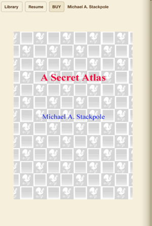
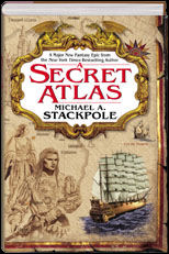
 Cover: The thumbnail of the print cover of A Secret Atlas shows up just fine in the iBooks library. The image at the left, however, is what you get if you click on the Table of Contents button. Not only does it look like crap, but the correct cover graphic is already part of the e-book file. Not only does this bulk out the file (raising Amazon’s download charge to the publisher), but it’s completely wasted data. Just put the book’s real cover there.
Table of Contents: I have complained about this aspect of things before with traditionally published e-books. Their design specs demand a fully interactive Table of Contents in the front of the book, right where it would appear in a traditional book. It should be noted that the print versions of A Secret Atlas do not have a Table of Contents, so this was cobbled together specially. This Table of Contents consists of page after page of hotlinks going directly to chapters.
As if anyone is going to page back through the book to get to it! You can’t, save by flicking every single page. Right up there in the upper left corner, between the Library button and the Buy button, you can find the Table of Contents button (where the Resume button is in the picture). You cannot make an e-book without one of them being generated automatically! It is available from every single page in the book. The only way you can get to their hotlink table of contents, unless you want to page back through the book, is to use the automatically provided table of contents. More wasted time and effort in generating something no one will use.
Front Sales Material: Another point I have made concerning e-books is this: publishers should put a list of other books available from the author, with hotlinks enabled, in the front of the e-book. Why? Because when someone downloads the free sample, as I did, they’d get a whole list of other books by the same author. This is simply good business. The print version of A Secret Atlas has an extensive list of other books I’ve written, right up there in the front of the book. There is no reason on earth why that should not have been included, with hotlinks.
Unless, of course, compiling that information would be too much work. The fact that it might sell more books should be a mitigating factor there, I would think.
Title Page: In the print version of A Secret Atlas the title page was beautiful. So, for the e-book version they simply shot .jpg of it and included it. The problem is that the title page was part of a two-page spread, which shows up as two separate, non-side-by-side, pages in the e-book. (That is a problem with the dimensions of the .jpg, I suspect.) So, instead of redesigning the title page so it looks nice, they leave it looking like a cut-and-paste job done by Ms. Finster’s afternoon art class at NimbleKinder Day Care.
The Map: As you can guess from the title, A Secret Atlas has something to do with maps. Bantam got the artist Michael Gellatly to do a lovely map based on my original sketches. It’s reproduced faithfully in the e-book. It’s wider than it is tall, so they put it on its own page. The writing on the map, unfortunately, is oriented vertically, not horizontally (ditto the compass).
What ensues, in trying to read the map, is hilarity, at least if you’re reading on a tablet device that switches orientation. As you turn the device to read the map correctly, the map revolves so you can’t. And, yes, it’s true that many devices allow you to lock the orientation, but the default isn’t set that way on an iPad, so I’d have to go digging around to repurpose that button. That repurposing is global, not specific to iBooks, so I’d have to switch it back if I want the button to work as a mute button again.
Nice idea with the map, including it that is, but a big, practical fail when it comes to the reality of reader devices.
General Formatting. It’s no secret that e-books are really just clumsy HTML pages all packaged together for convenience. However, this does not mean that a book needs to look like a web page. To give Bantam their props, they did ask for indenting on paragraphs. That looks good.
What looks like hell, and I see this all the time in lousy e-books, is an extra line between paragraphs. That’s what a web page looks like. E-books don’t have to. I don’t do that in my books. And the place where you see it most in A Secret Atlas is in the chapter headers. What should be a compact little collection of lines now takes up over half a page. What should have been almost invisible now has to be waded-through. It’s just one hot mess.
As noted above, this is not about Bantam or Random House. I’ve seen the same sort of things in books from plenty of imprints. It’s indicative of a general indifference to the e-book reading audience and a willful ignorance of how e-books work and what readers want. And since, at latest guesstimates, at least 30% of publishing’s income is coming in from e-book sales—and rising—they’re really past the point of creating a good impression. Smaller, leaner houses, more able to move with the times, will be setting the standards against which they will be judged. Individual authors can do that, too—I’ll let you know when I have the e-book version of Eyes of Silver ready and you’ll see what one guy can do with a bit of imagination and some basic book design knowledge.
Readers should take note: authors have absolutely no control over what our e-books look like. I’ve asked publishers if they’d let me do my own version of my books, just so they’ll look good. The silence of their responses is chilling. (The time to redo A Secret Atlas would be inside of an hour.)
The attitude of “if they want it, they’ll buy it no matter what” has contributed heavily to traditional publishing’s current straits. Claims of being the gatekeeper get undercut badly when production efforts show contempt and lack of respect for the folks who pay their bills.
Writing up this series of blog posts is cutting into my fiction writing time. If you’re finding these posts useful, and haven’t yet gotten yet snagged my latest novels, please consider purchasing a book. Nice thing about the new age of publishing is that you become a Patron of the Arts, letting writers know what you’d like to see more of simply by voting with a credit card. (Authors charge less when they sell direct, so you save, we make more, and that frees us to write more.)
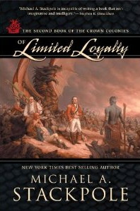
 My latest paper novel, Of Limited Loyalty, is due out in December and is available for pre-order now.

My digital original novel, In Hero Years… I’m Dead is available for the Kindle and in the epub format for all the other readers, including the Nook, iPhone, iPod Touch and iPad. (Imagine the Batman, Watchmen and Kick-Ass movies all rolled into one, as written by Dashiell Hammett, and you’ve pretty much got the idea of the book. Oh, and with some satire and political commentary slipped in for irony.)


 21. Feb, 2012


14 Responses to “E-book Design doesn’t have to be bad”